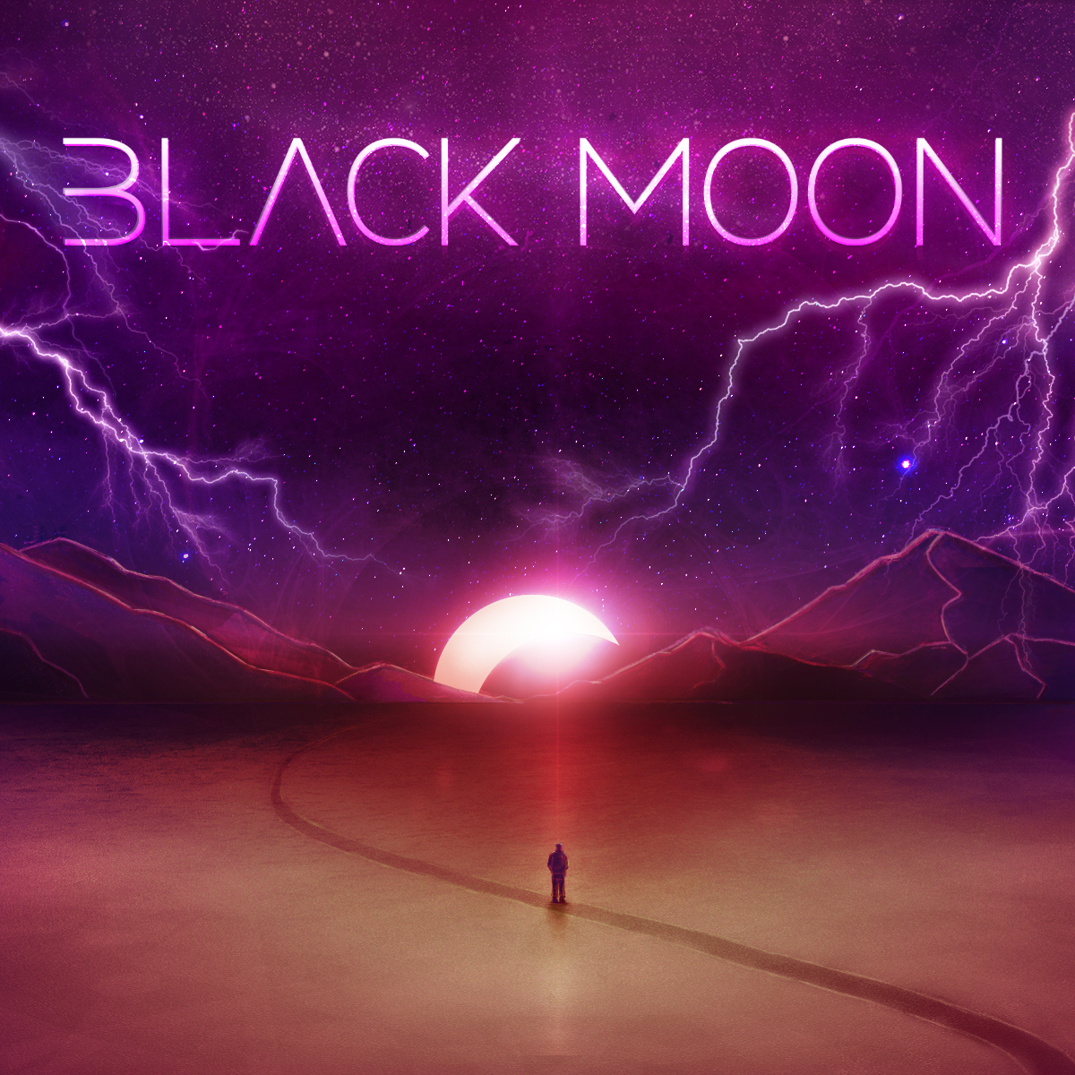
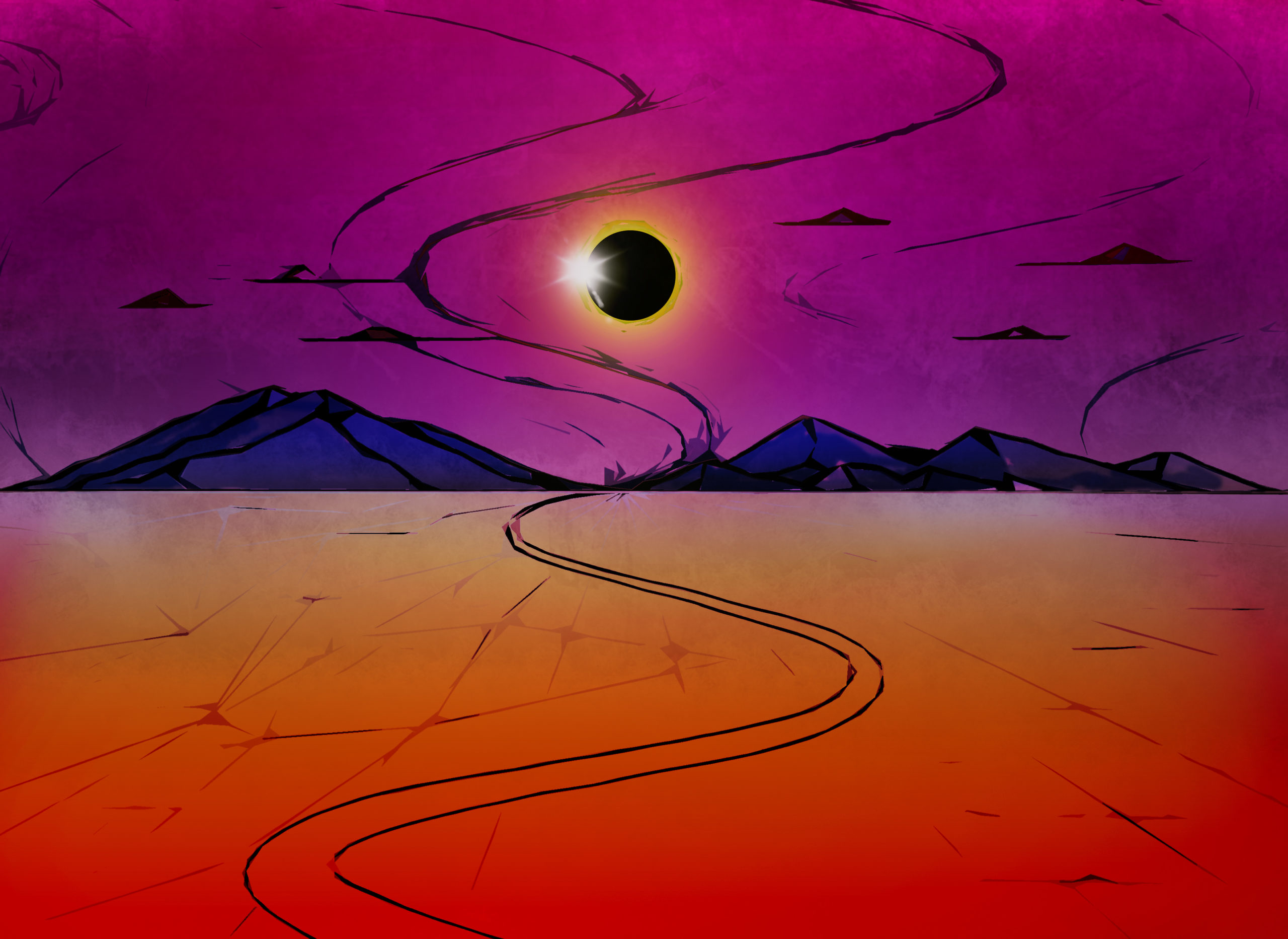
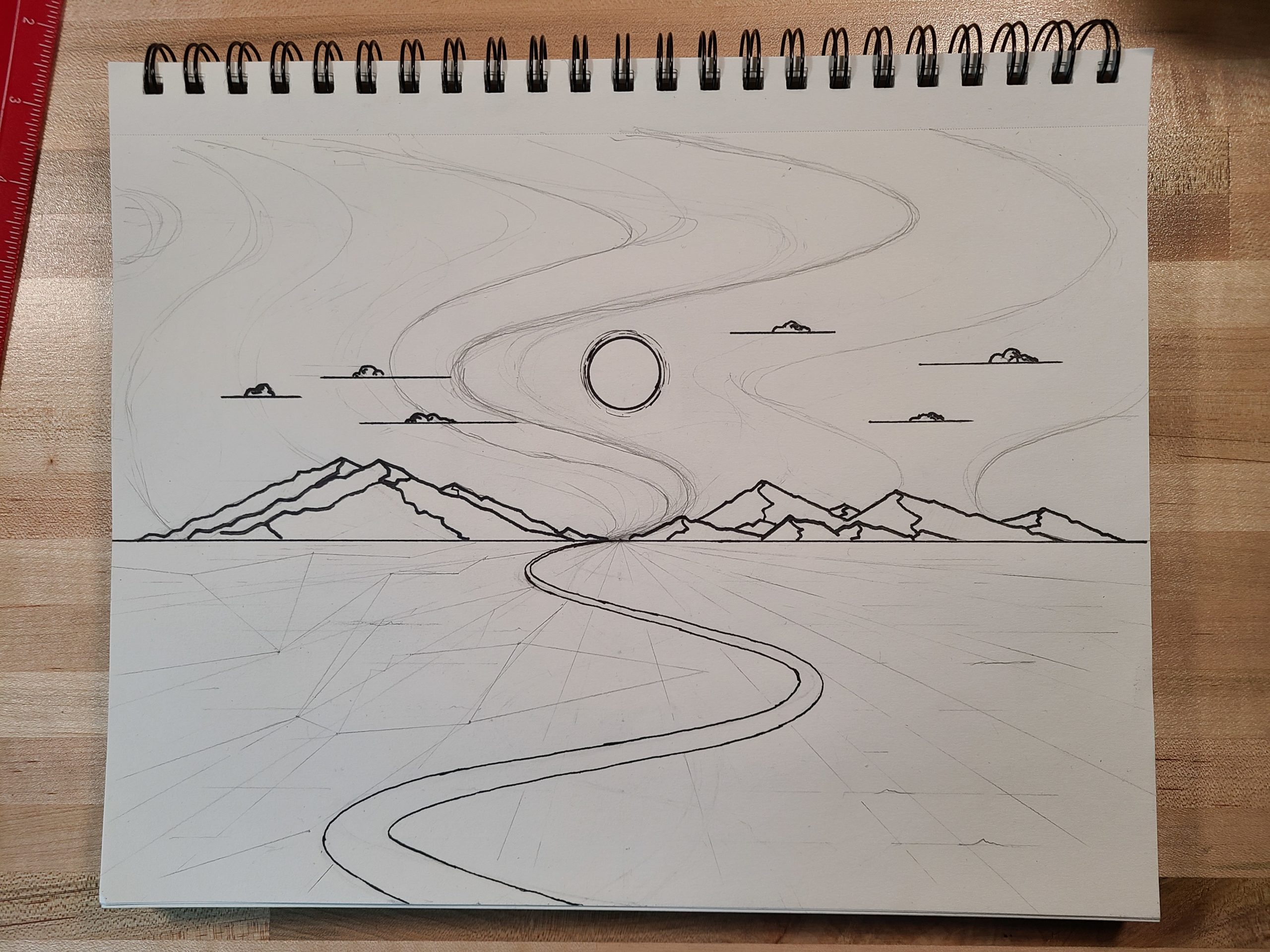
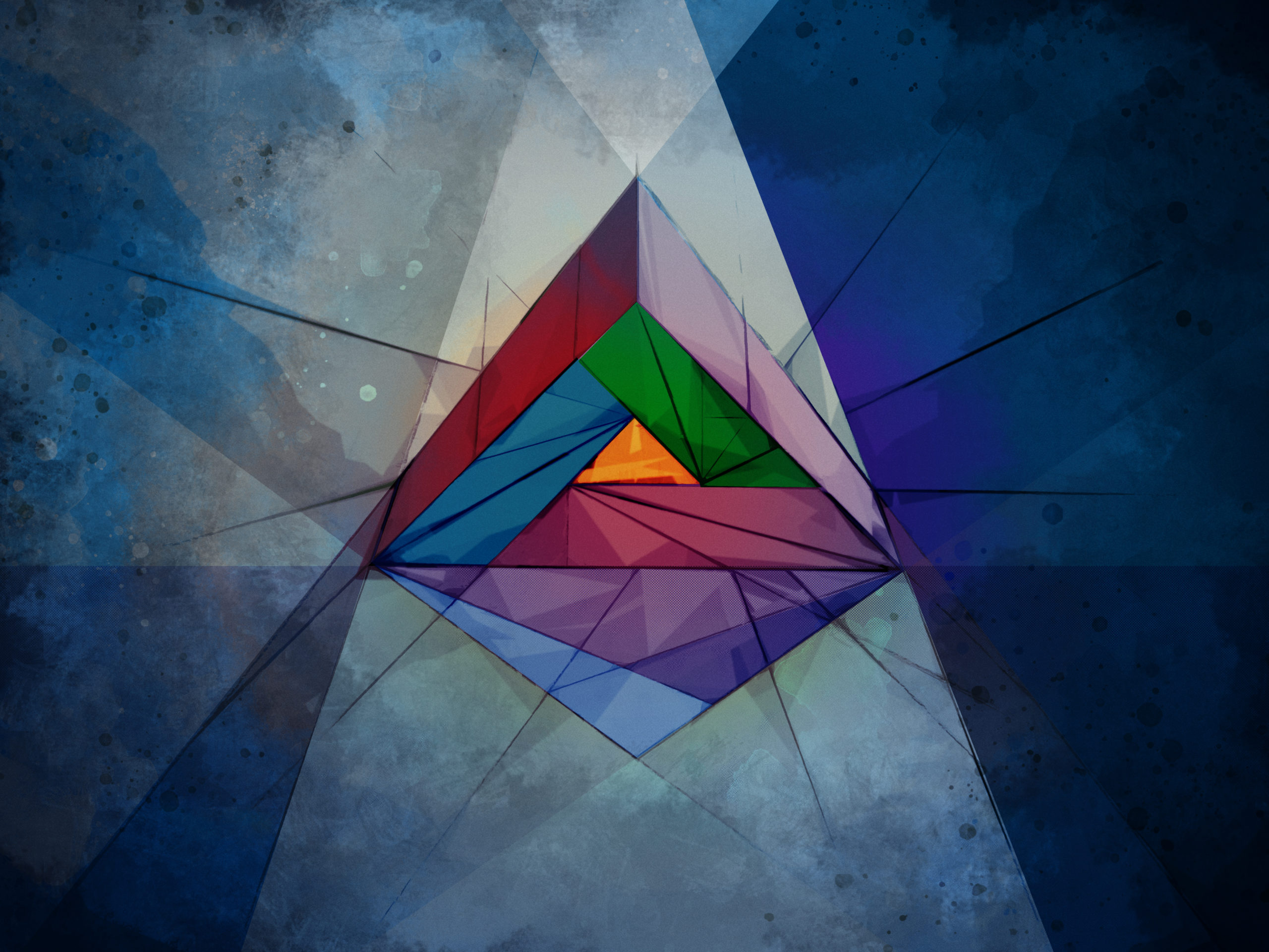
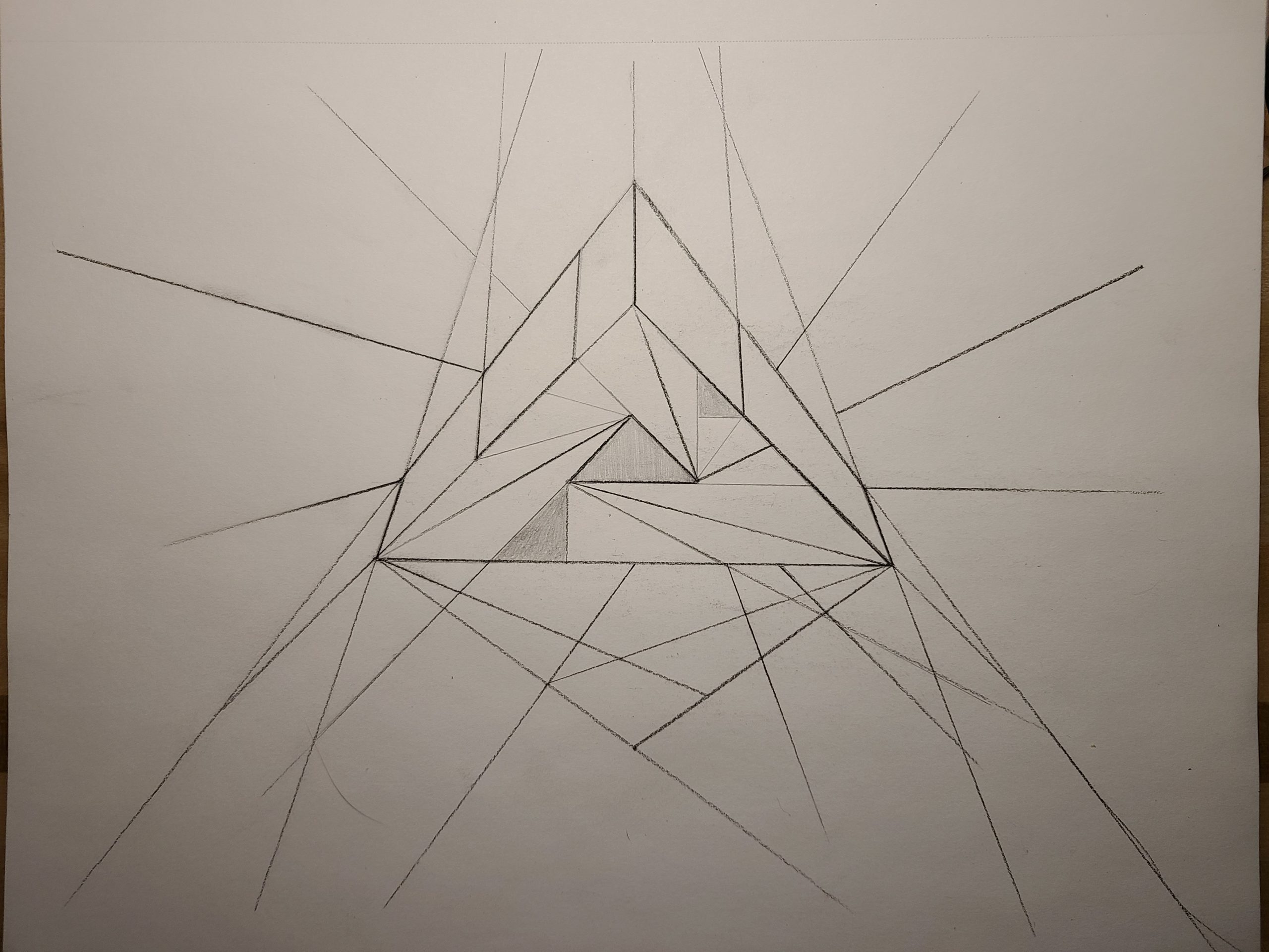
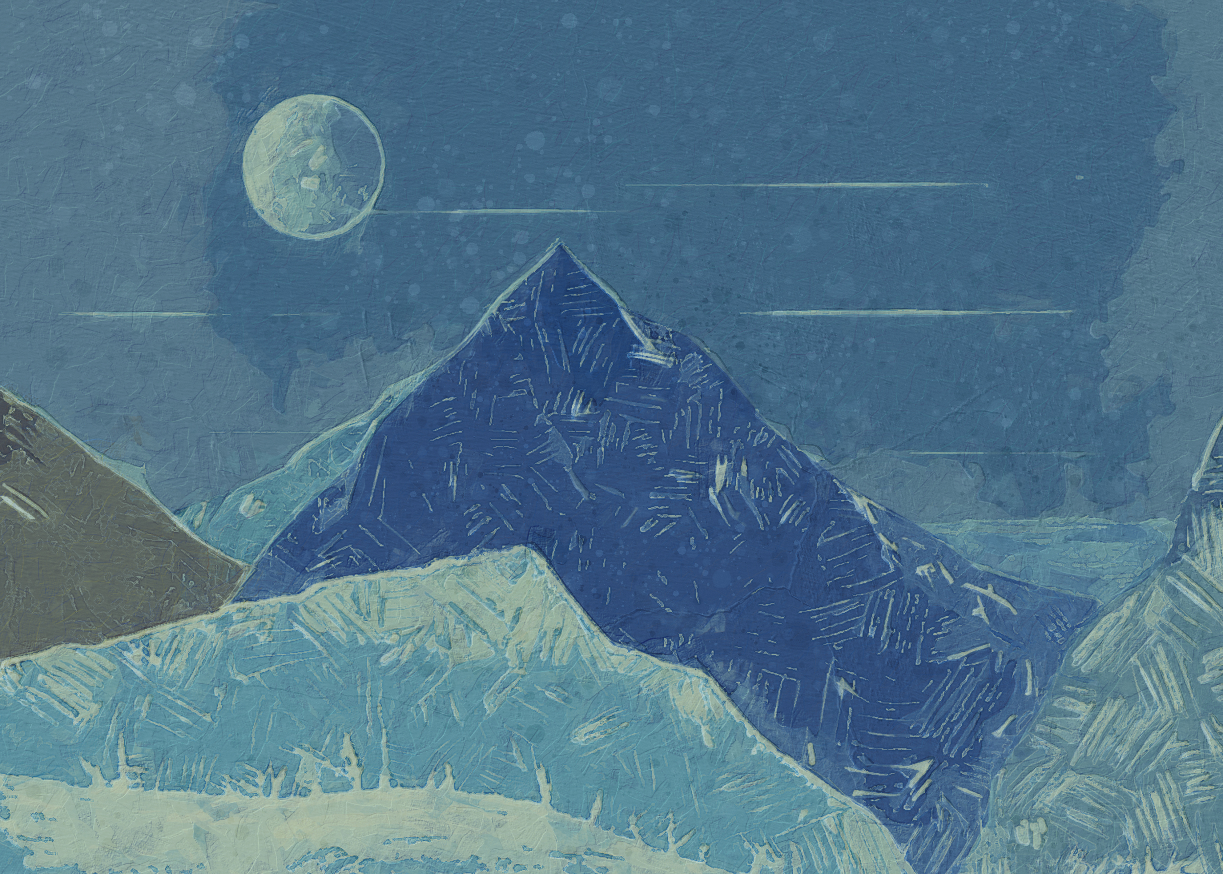
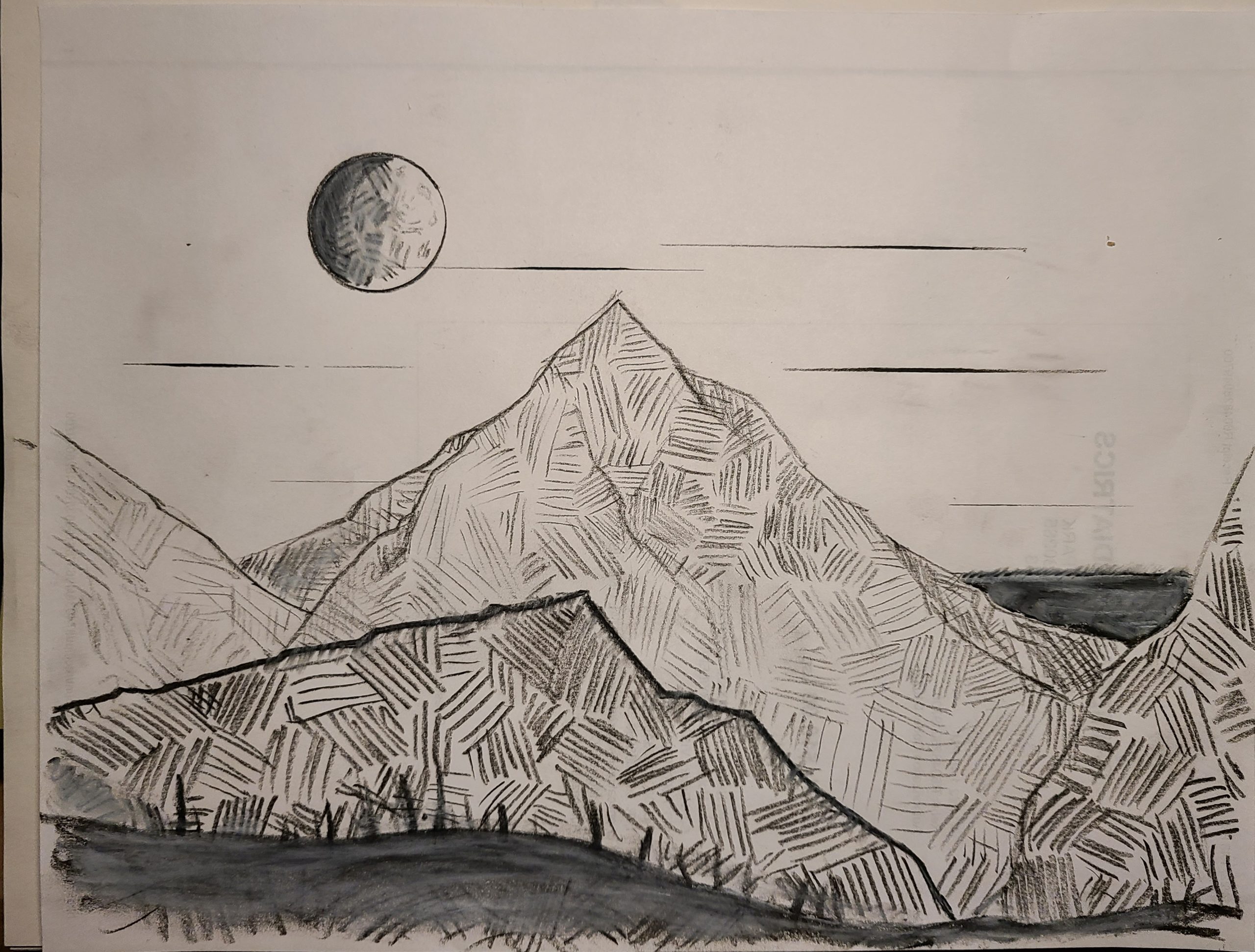
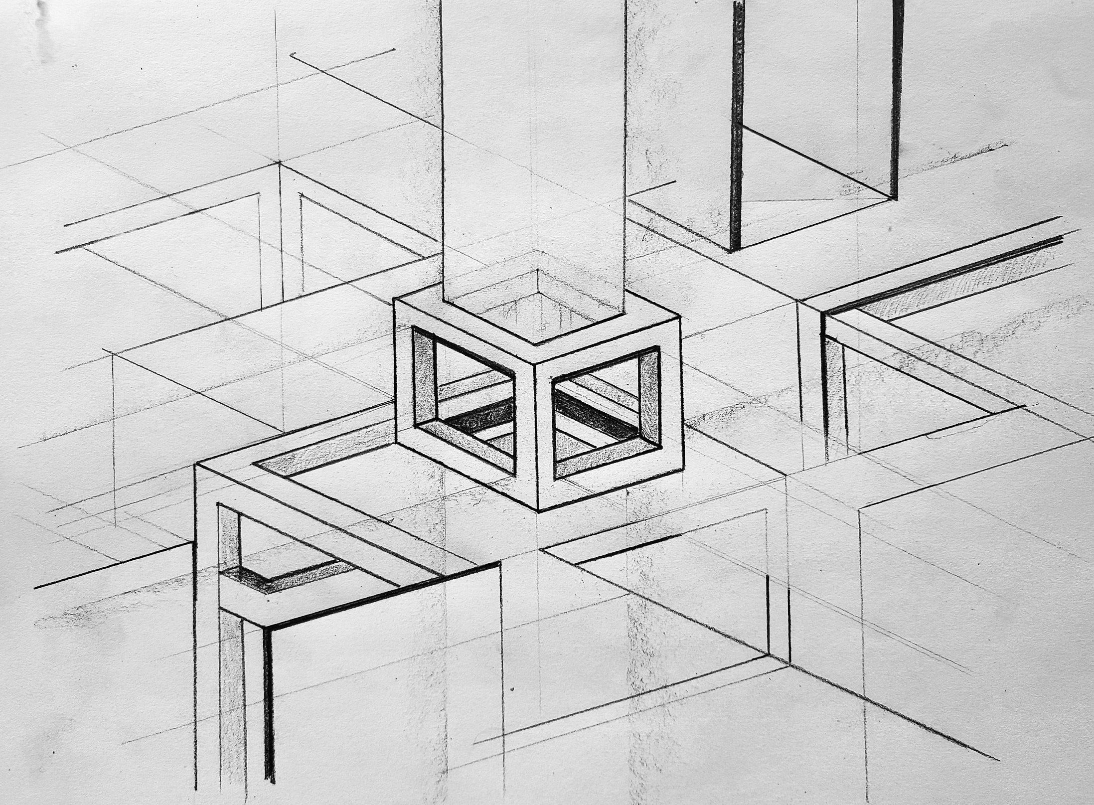
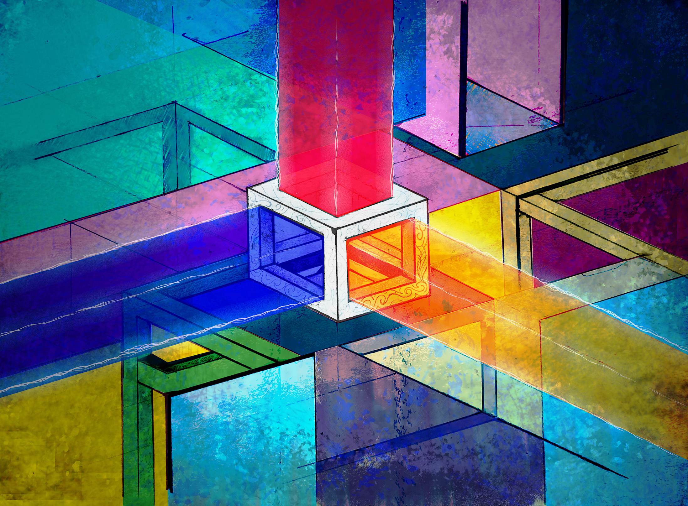
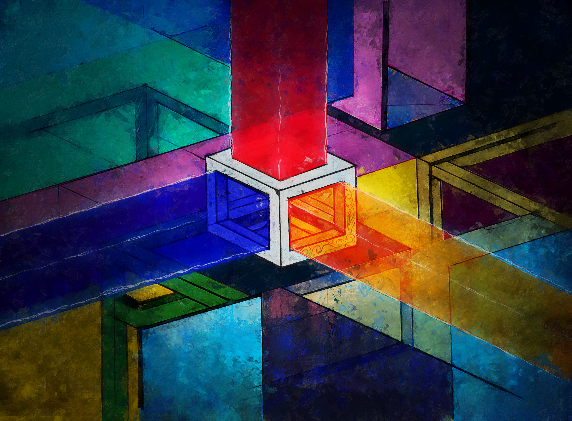
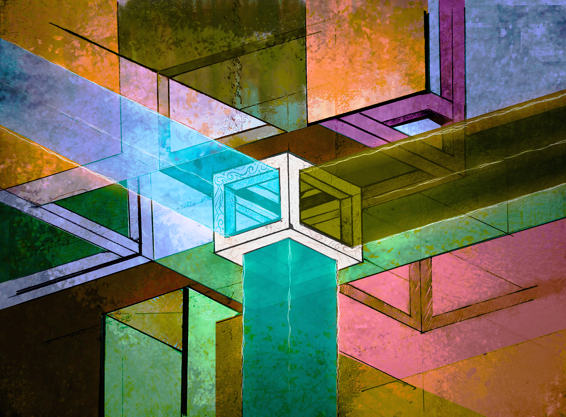
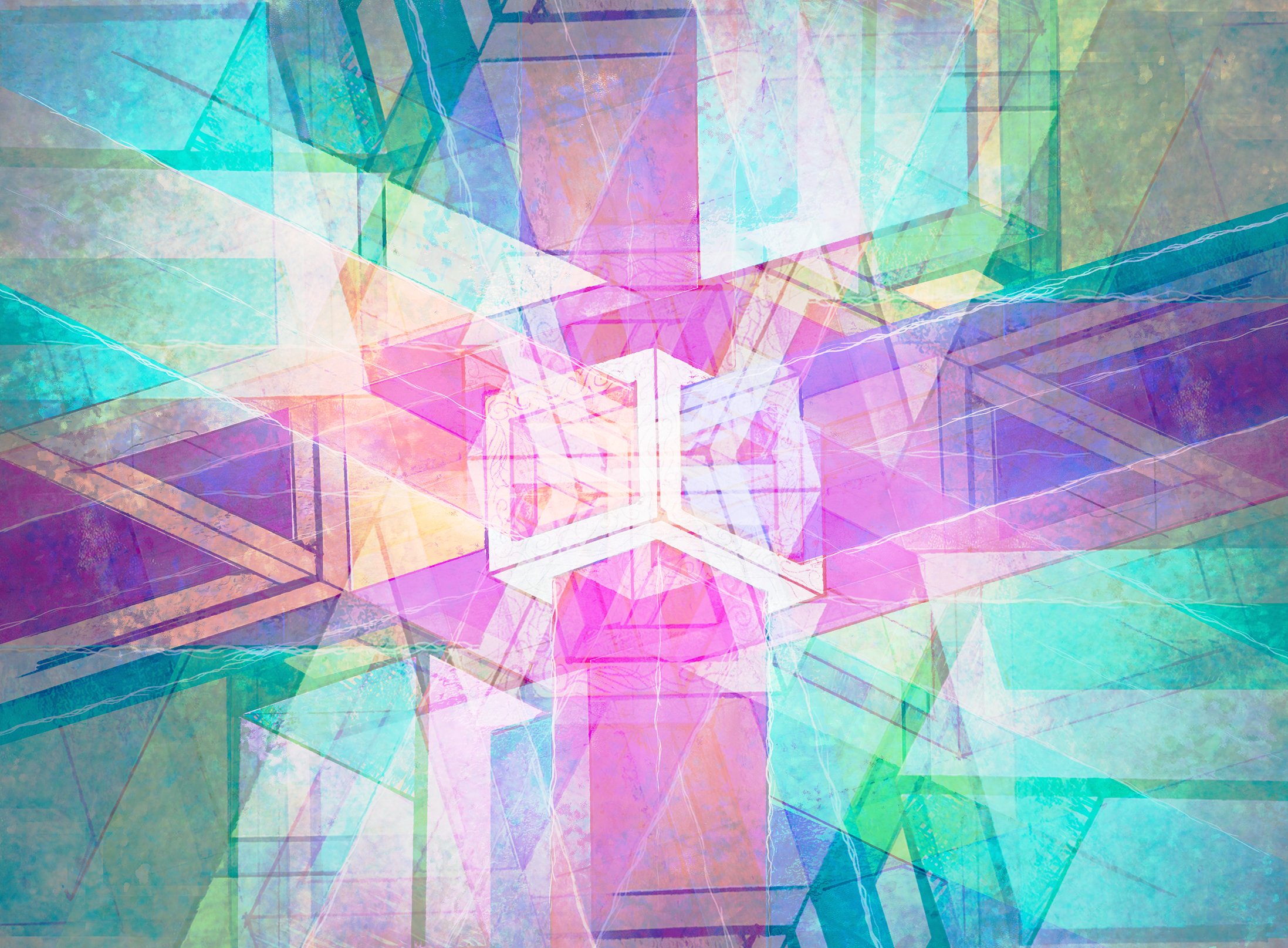
Paper to Digital #1

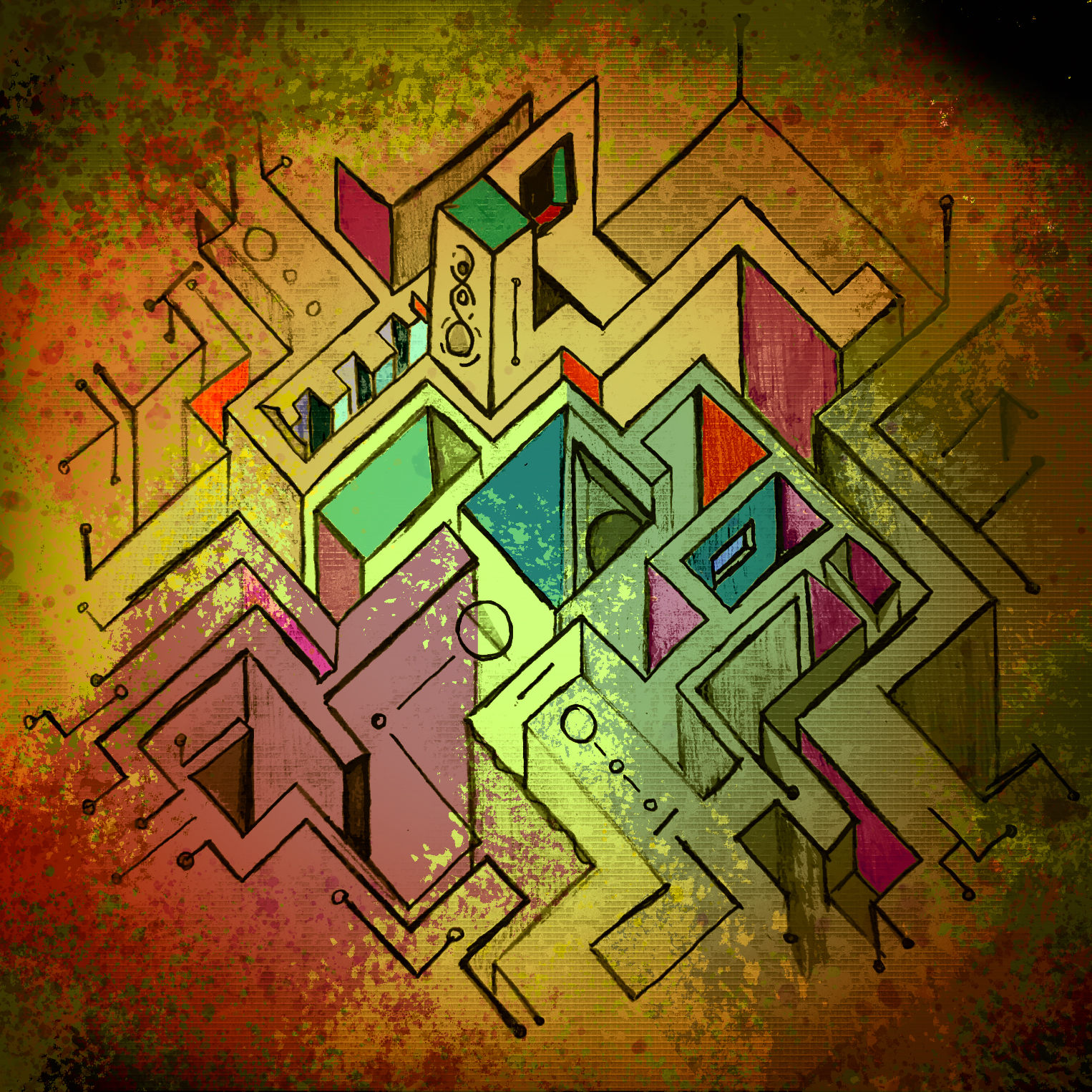
I’ve created several dozen pieces of work by hand and converted them into a digital format for finishing. Yet, none of them were properly documented. I am hoping to remedy that by showing my process from start to finish. I am still working out the finer details though such as how long a video should be, when to highlight things or slow it down. I realize I am talking over a video that has been sped up significantly, so that was a challenge.

This is more of an overview of how it goes and less of a “how to.” I do plan to go into depth a little more on my process. There’s nothing groundbreaking about each element but when you add them together the sum is greater than the parts. I’ve yet to come across a particular style that employs the same techniques I do. Again, art is subjective and what is amazing to someone can be utter garbage to someone else. My drawings are an exercise for me to stay savvy with the tools of the trade and to explore new ideas that I might not have otherwise. On with the video!


Design Challenge #1

Ever since I’ve started back drawing by hand, I’ve wanted to stay more current with design trends. My usual style is minimalistic and clean. I’ve decided to step outside of my comfort zone though. One of the styles floating around for 2022 is, of all things, maximalism. In fact, I’ve read that minimalism is dead! RIP! C’est la vie. I mean, even the spell checker doesn’t recognize the word maximalism. Well, this is what we’re going to delve into.

A good place to start is a simple design for social media. With things like Canva it’s beyond easy to do this stuff by hand. That said, doing it by hand gives you control of every single element from concept to end product. You can create your own templates to keep from reinventing the wheel over and over again. Work smarter, not harder.

Maximalism isn’t even a word!

All that said, I gave myself about half an hour to create something loud and a bit out there. It’s out there for someone like me, at least. First of all, I chose two fonts that contrast each other. Gave those two fonts additionally contrasting colors. Geometric and abstract art seemed fitting so that’s the text as well. Popped in some shapes here and there. I used the dashed line to indicate where you might start and end. Topped it off with some busy backgrounds, including an old magazine page that I made to look torn, in a neat way.  The cherry on top is the call to action to learn more about this place and what all you might find there.


The Gallery

I’ve read that 90s iconography is back in as well. All I have to say to that is “wow.” I lived through that and never thought I’d see the day that stuff made a comeback. Then again, everything comes and goes. Funny how it works like that. Maybe I’ll give the 90s look a try for the next design challenge, despite working quite hard to get away from it in the early 00s!

Single Artwork – Black Moon

This work is derived from the project I’ve titled Black Sun, which is an alias and not the actual name. I basically took a snippet from that work to make this work. The Black Sun artwork that I posted was a very early iteration of the work. While the finished work looks similar it’s a lot more, well, finished. Detailed, even. Electrifying, perhaps.

So, here’s a sort of sneak preview of the work. Instead of the eclipse being at totality (moon completely covering the sun), the sun is rising with a partial eclipse visible, on the horizon.

This is actually something I’ve personally witnessed. Seriously, if you have a chance to see a total eclipse; do it. Cancel the beach trip or the ski trip or whatever. Words and photos cannot begin to describe what it looks like, feels like (the air temp drops), and yes, sounds like (nocturnal critters begin to wake). It is otherworldly. I digress.

So, here’s the work for the Black Moon single that my son commissioned from me.

Album Artwork – The Black Sun

My son tasked me to create some art for a solo album he’s working on. His list of wants was a desolate, winding road, distant stormy mountains, a solitary figure, and a black sun (or eclipse).

Most pieces I do are somewhat random and just fall into place but I needed to spend time thinking on this one. I penciled up the initial work and after several iterations of how I wanted the road to look I ended up with the final pencil work. I referenced actual winding roads on flat plains, as well as I could. With most everything else I took creative license.

With the digitized version now taking shape I used my normal workflow of smart objects with varying degrees of the cutout filter. I love that effect. However, it felt too plain, pun intended. I wanted to add texture and more depth. That’s where the digital painting comes into play for creating some of the lightning. Some of it is actual photographs of lightning. I wanted it to look realistic vs drawn/cartoonish. The star field in the back is also a real star field. The eclipse is just an illustration however, I might use a photo I took of an actual eclipse from 2017. 🤔

This is as far as we’ve gotten with it. The title now comes into play which will have to fit in with the design aesthetic. For now, here’s the piece I am calling Black Sun.

Bill from Gravity Falls? Buy gold! Bye!

Jokes aside, this piece had me use a couple of extra filters to get the look I wanted. I normally just use cutout filters on a smart object but one of them I blurred a little bit. After that, it’s gradient maps and painting by hand. Well, a digital hand, that is.

I am going to show my entire process, as I mentioned in a prior post. I am figuring out how best to present it. Each one is different but I follow the same basic techniques that I mentioned above.

I almost made an Illuminati joke but I’ve watched Gravity Falls again recently and I had to toss Bill into the mix.

The next piece is probably going to be a tree I sketched. I found a nice effect that makes it ethereal looking. 👻

Find Your Why

I’m now in my mid 40s. I remember being in my late 20s thinking I knew so much. I did know enough to realize what I didn’t know. I just didn’t know what that was. It was the why.

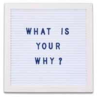
For a long while now I have stated that science [communication] was a driving force for me. It was my why. It didn’t sit right with me though. It felt empty not to mention entirely out of reach. Still, I like to share knowledge of what I know so that someone else might benefit. That’s when I found my real “why?”
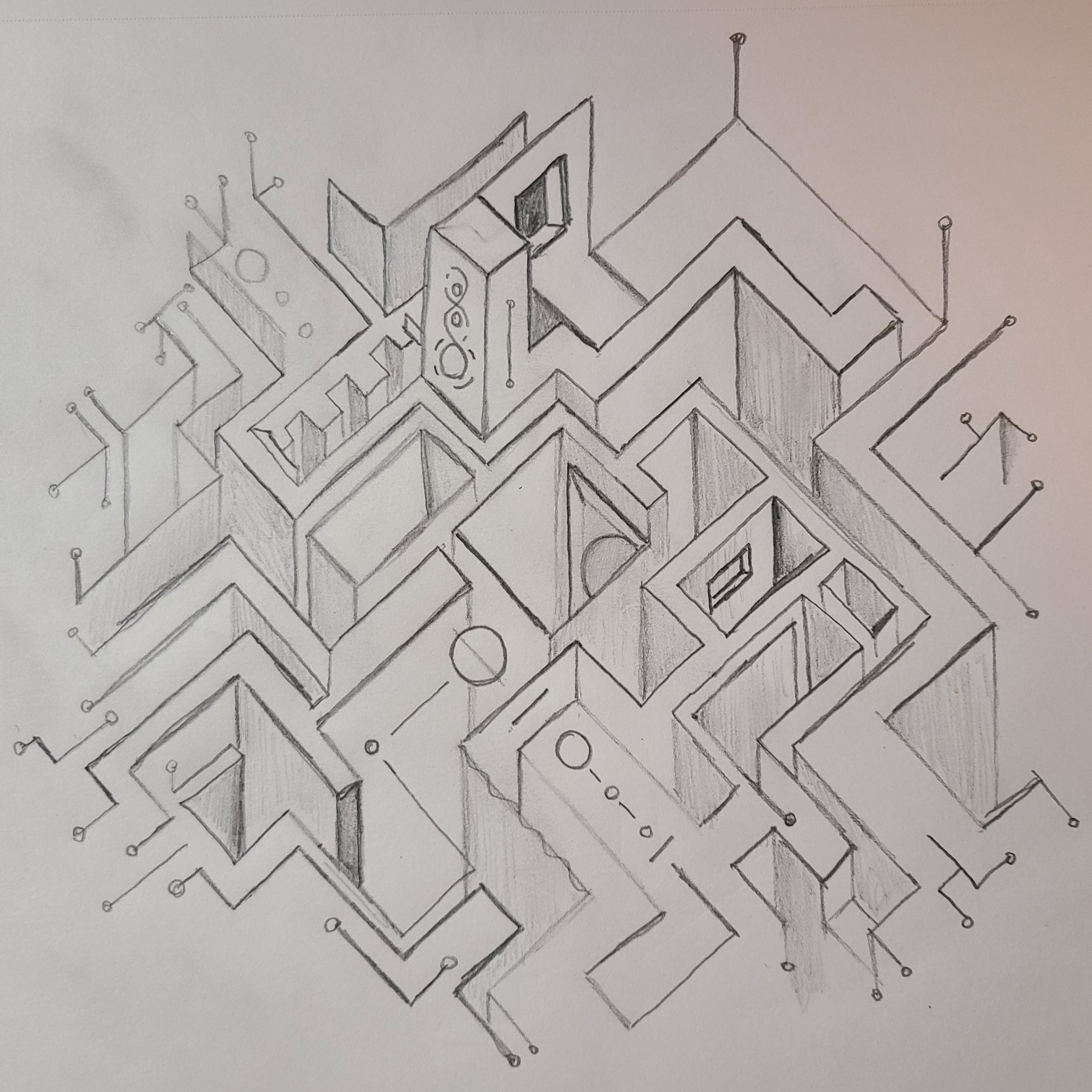
I love to share knowledge. It could be about editing a video and optimizing the bitrate. It could be about how uranium decays in such a way that it was used to determine the age of the Earth. I can tell you that a certain weather pattern is conducive to severe weather. I know those things enough to explain them because I learned them in a quest for knowing how the world works.

Find your “Why?” and get ready to do some hard work.

I am at a point in my life where I can start to really carve my way into the “why” and hopefully end up a better person for myself, my family, and my friends. Things change, we all change. It’s the nature of things. Months or years from now my trajectory might change but my drive to share knowledge won’t. I’ve always had it and I always will.

Misty Mountains? Mordor? + News!

The landscape that almost wasn’t. I wanted to practice a super-fast sketch for the “real” sketch. However, I was kind of diggin’ the practice one. So, I went with it. The funny part is that it was done on the back of a receipt from a doctor’s office. 🤷‍♂️

One variation is basically a snowing mountain-scape. The other? Mordor! I do favor the blue one personally but I also thought the red one was kind of neat and had a Martian look to it.

News!

Soon, I am going to start sharing more of my process from beginning to end. All you see now is a sketch and the variations of the final results. I want to take it further so there’s a sense of my workflow and how it can either be meticulously planned or entirely random.

I seldom create art with the exact end result in mind. Anyone that says they do that is lying. The process involves ideas, refinement, more refinement, and more refinement. This is the art of being an artist. All things are subjective in this realm. I know my work isn’t for everyone but I respect that. There are other artists’ styles that make me scratch my head but that’s their style.

Expect more from me in the coming weeks.

The Colors That Surround

In continuing with using lines and optical illusions I created this piece. Most of the art I create starts as a single idea and it develops from there. The idea here is that the cube at the center is devoid of color itself, yet, it projects it all around. The analogy is that of the Universe being devoid of life, by default, yet by chance, we’re here to observe it. Was that a stretch? A bit.

I like to play with alternate versions sometimes just to see what happens. The process of coloring these images starts in the most low-tech way possible. I take a photo of the drawing. I do own a scanner but I find the photo I take gives it more character. If I never said anything, one might not know.

After that, it’s several filters on smart objects and gradient mapping along with some manual placement of elements like paint spatter or other textures. It’s a style I’ve grown to like and it yields interesting results. 😊

The Celestial Circuit

I seem to have a fascination with multidimensional-looking things. When I start drawing something I either go with lots of curvy/wavy lines or I make things rigid and cube-like in nature. I’ve always enjoyed the work of M.C. Escher and maybe that’s kind of influenced me a little. Though, it’s been years since I looked extensively at his work.

It doesn’t make any particular sense but I like to follow the lines around and see if they lead to something below or if they hit a wall. I tossed some celestial stuff in there also along with what looks like leads on a circuit board.

Throw in a little random color and there you have it. The Celestial Circuit? I posted this on social media but those ones didn’t have as much color as this one. So, bonus content if someone made it this far.

I think I might use a ruler next time I do something like this. It makes for cleaner lines but c’est la vie.

Green Marble. Green Planet.

I have gotten into the habit of imagining what a round/spherical object would look like if transformed into a “planet”. I did it with the atomic fireball candy a while back.

This was just a marble perilously perched on a Cricket SIM card holder. I had my macro lens and thought it looked cool. Later I was scanning photos and immediately thought to myself, “it’s planet time!”

First thing? Cut it out and isolate planet shape. Add inner and outer glow to simulate an atmosphere. The tricky bit is the shadow. If you mask the object itself, the layer effect will follow suit. The fix? Take the layer and any other corresponding “planet” layers and group them. Then, mask the group. But we’re not done yet.

You see, planets, even when dark, are opaque. So if you mask without something behind it, it’ll look like it’s see-through. Easy fix. Take the same planet shape, duplicate it, drag it below the group that is masked and adjust it to be black or very nearly. Add some stars in the back. Done.

You now have an alien world. Or, a marble in space? 🤔

Like the Mars one, here’s the PSD if you want to have a looksy.