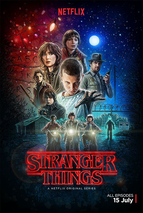
There’s this show everyone is talking about and one day I might get around to it. OK, I’m joking. I watched it the day it came out (that goes for Season 2 as well). If you don’t know what Stranger Things is, you should check it out. It’s pretty darn good. Me being me, I wanted to “Stranger Things” up my Facebook cover but I couldn’t find anything pre-made. Again, being me, I figured I’d just make one myself. All I need was a good source to start with. Thankfully, there were tons of images of the poster. It’s the standard 24″x 36″ size but I felt motivated to try and make something fit into the 851×315 cover image size for Facebook.
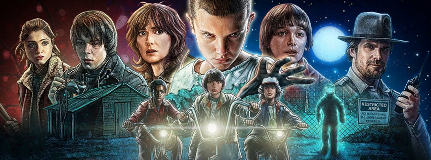
The first thing I wanted to do was make sure I kept all the characters so I’d need to isolate them all and do some rearranging. First things first, I took to the polygonal lasso tool and got to work. Some people prefer the pen tool but I feel more precise with the lasso tool and I’m faster with it. After a few minutes of snipping everyone out of the image I got to work with positioning them.
I wanted to basically keep them in the same relative location but Will being at the very top posed an immediate problem. While he is central to the story, Eleven is more prominent. I could work with that. Will would come off the top and to the left of Eleven (Eleven’s left). Conversely, Joyce would also come down beside Eleven but not quite as much. I also had to draw in some extra fabric on Joyce to make it look right. I also scaled her down a bit compared to Eleven. That was the most labor intensive part really.
With that done I could position Jonathan and Nancy over near where they originally were (left side of the image). Hopper would take a spot basically where he was before (off to the right). Though, I put the Moon right in between Will and Hopper because I didn’t want to lose it. They were probably the easiest characters to arrange.
Next, I had to deal with the last three protagonists; Lucas, Dustin and Mike. Actually there wasn’t much to do except make sure they didn’t get cut off. The other thing I did is that you can see Eleven’s hand directly behind Dustin. It was the only place to put it really as it would look ridiculous if her hand was reaching “out at you” but was behind the bushes. It would also look even worse had it obscured Dustin. It works for me. The thing is that I wanted a basic symmetry and for it to not get too crowded in any one area. Including the guy in the hazmat suit, both sides are even with Eleven and Mike lining up top/bottom. Good deal.
Ok, last but not least, the background. I wanted to keep the colored lights and the night sky. so I just cut them out, scaled them accordingly and did some color tweaking. The only other thing I did at this point was put a very subtle glow around Eleven. I wanted to make her pop a little bit more. If I didn’t mention it, you might not even notice. In fact, I did those so long ago that I’ll probably make a couple of edits to this blog to say “Oh and…”
The finished product:
For now, that’s my journey from full size poster to tiny Facebook cover image. If anyone wants the PSD for whatever reason. I can provide it.